
FCT - Fundação para a Ciência e a Tecnologia
EDITORIAL & BOOK DESIGN / WEBDESIGN LOOK & FEEL / ICONS; 2021/22

A book design project printed with 394 pages
and a study of the new
FCT website look & feel.
BRIEF
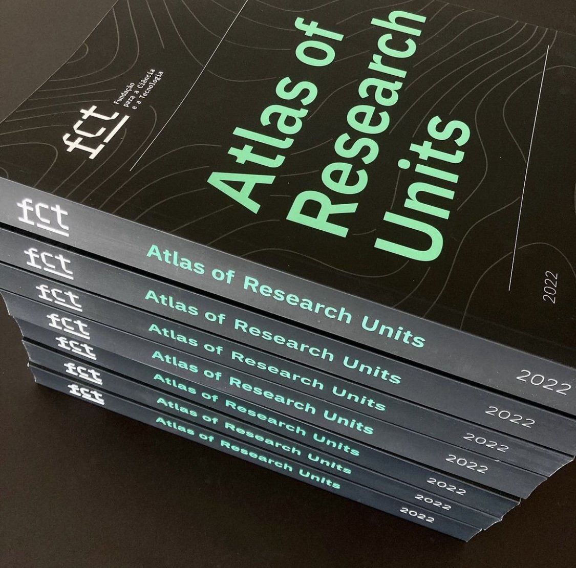
The book: 394 editorial pages designed from scratch.
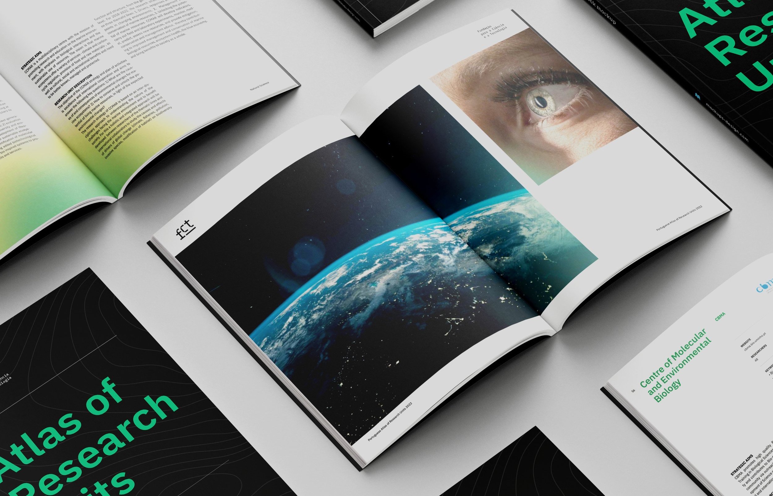
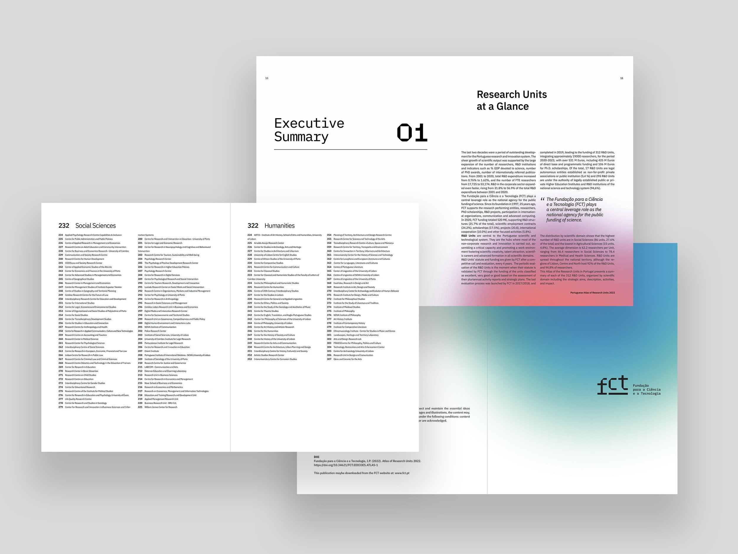
The Atlas of R&D Units is an FCT publication that gathers information on the 312 investigation Units selected for funding. It's a reference book for the most important research projects in Portugal.
The website: The website needed to follow the newest FCT rebranding, therefore, I was asked to develop a few exercises for cards, banners, and icons set.
-
O livro: 394 páginas desenhadas de raíz para o “Atlas das Unidades de Investigação e Desenvolvimento 2022”, que contempla 312 unidades de investigação selecionadas para apoio financeiro pela FCT. O livro é uma referência para os projetos de investigação mais importantes de Portugal.
O website: O site da FCT precisava de se atualizar para seguir o registo gráfico do rebranding e por isso desenvolvi alguns exercícios visuais para algumas áreas do site, banners e packs de ícones.
The work behind the book:
Building the Grids
The goal was to plan an editorial grid that is not too dull and that fills out the need to condense a lot of technical information elegantly.
-
Por detrás do planeamento de um livro existe a criação de uma grelha “invisível” para a inserção de texto e imagem.
Neste Atlas havia a necessidade de criação de uma grelha elegante que não fosse muito aborrecida e que conseguisse condensar muita informação técnica.


Adding texts, images and color:
Designing
the book
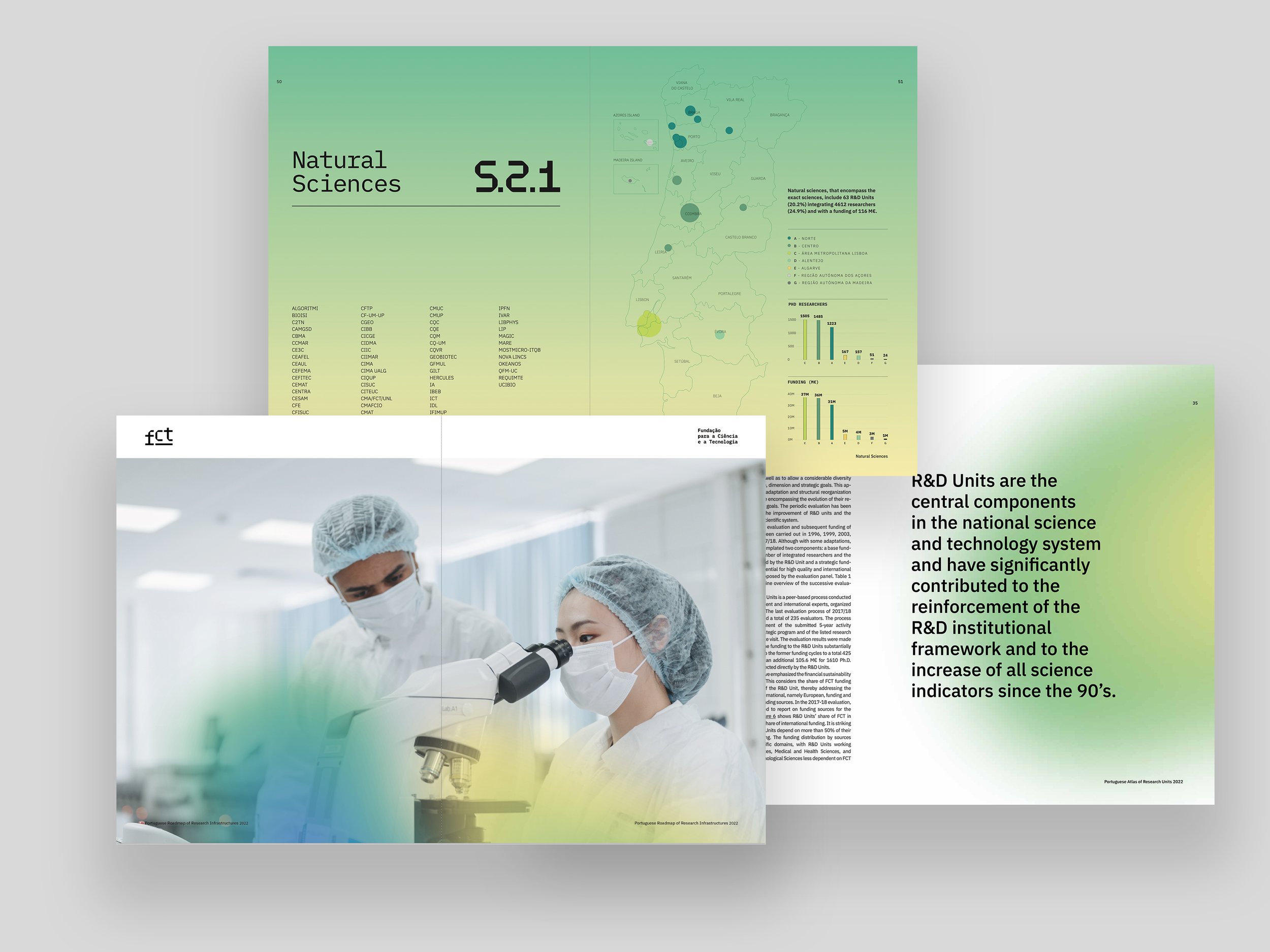
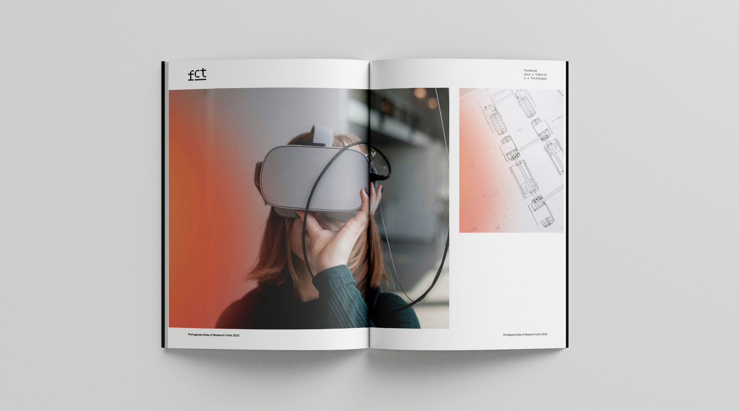
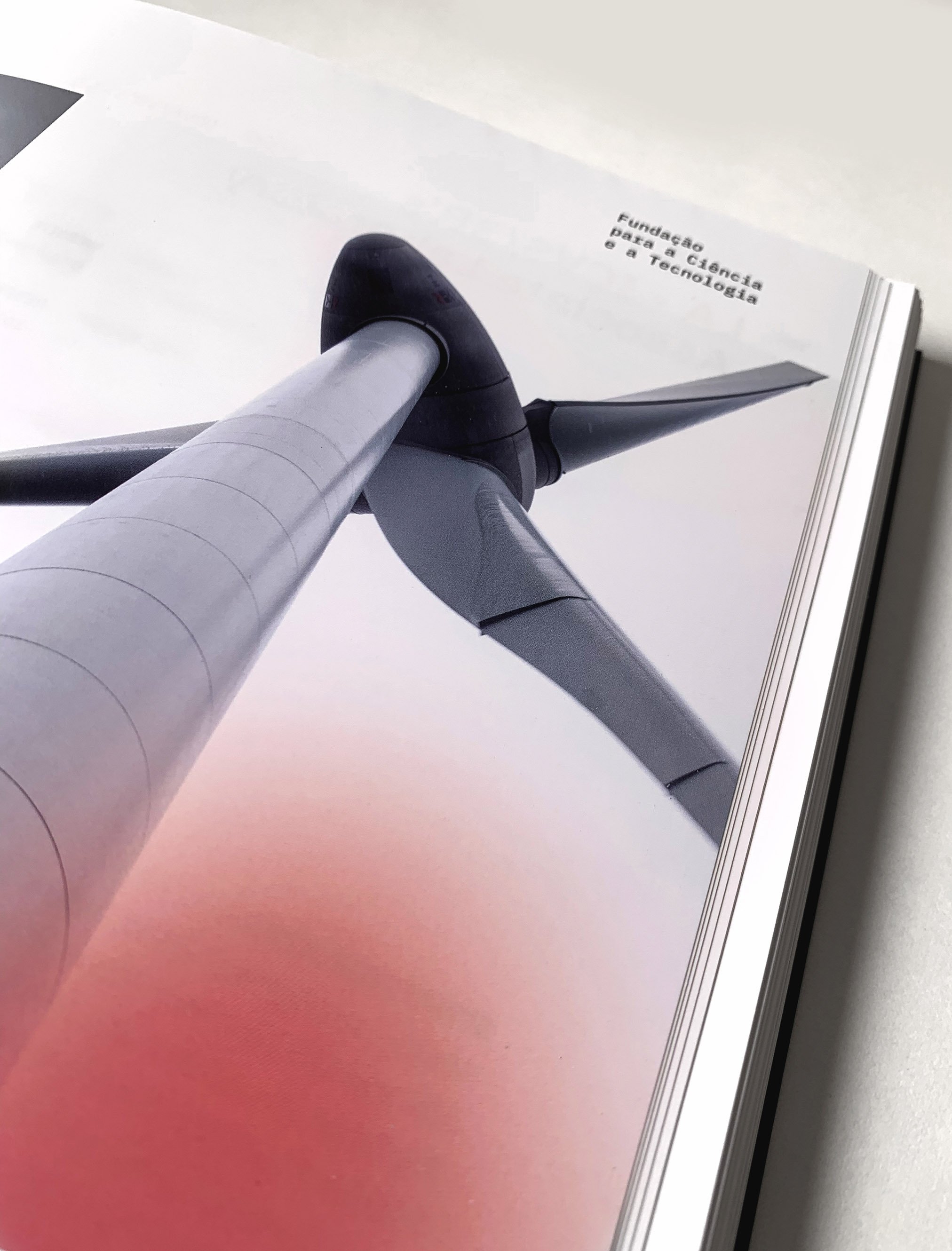
Choosing clean and modern images was an essential part of the project. Also, the punctuation with bright colors in single and spread pages makes the blocks of content less serious and repetitive. Overall, the book becomes lighter and more accessible to read.
-
Adicionar textos, imagens e cores por cima da grelha.
A escolha de imagens simples e modernas foi uma parte essencial do projeto. Pontuar o livro com cores vivas em páginas simples e duplas fez com que os blocos de informação se tornassem menos sérios e repetitivos. No geral, o livro tornou-se mais leve e com uma leitura mais acessível.


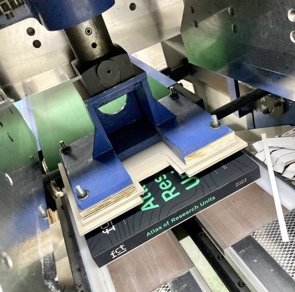
Printing
and final look
As a final result, the book was finished with a soft matte cover. The cover lines were printed with a slightly raised, clear gloss varnish.
Print production: Elias Produção
-
O livro foi encadernado com uma capa mate. As linhas da capa levaram um acabamento de verniz com alto relevo.
O processo de impressão teve a coordenação de: Elias Produção.


Web: icons
and images
For the website it was designed simple icons in line with the brand standards.
The selection of images (which are presented in multiple banners, heros and cards) were carefully chosen, in order to offer credibility to the Institution.
-
Para o website, eram necessários ícones simples em linha com a marca. As imagens que representam os vários temas do site (e que marcam presença em banners e cards) foram cuidadosamente escolhidas, de forma a ofereçer credibilidade à Instituição.

 Website Banners

 Website cards
